Learn how strategically placed lead magnets on your blog can engage visitors and grow your email list with new customers.
Is your site generating traffic but you can’t seem to get visitors to convert? Then your copy, call to action, or lead magnets may not be compelling enough. Or the issue could be that you are not offering anything of value.
The goal of any blogger is to convert their visitors into potential customers. As many successful bloggers can attest, “the money is in the list.”
But in order to get people on your list, you need to have some sort of lead magnet or multiple lead magnets.
If you don’t know what a lead magnet is, it is a marketing incentive in which you offer a visitor something of value in exchange for their email address.
When creating lead magnets, there are a couple of things to keep in mind.
- It has to be of great value. No one is going to give up their email if they don’t see your offer as something that is of value to them.
- Make sure that what you are offering is something that connects the reader to your content. Meaning, that if your blog’s niche is in finance, you don’t want to offer them an ebook or some other product that’s about a plant-based diet. If your blog’s niche is in finance, then you need to offer them a product that would help them, whether it be personal finance, budgeting, investing or the like.
Above the Fold
You need to place your lead magnets in places that catch the reader’s eye immediately.
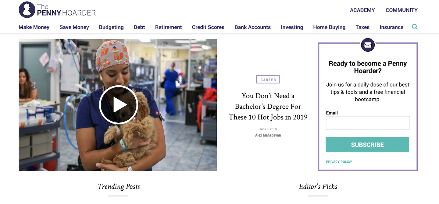
One such place is above the fold on your site’s homepage. See the example below.

In the above image, you can see that their lead magnet is above the fold and to the right.
There are a couple of things to note.
- Their message is short and to the point. You know what you are getting if you enter your email address.
- A link to their Privacy Policy is conveniently located at the bottom of the form.
Not all lead magnets should be short and sweet or have the privacy policy conveniently located. I am just pointing out what they have done well with their lead magnet.
For the up and coming blogger, I would suggest that the form be a bit bigger and prominent in its placement.
Let’s take a look at another example.

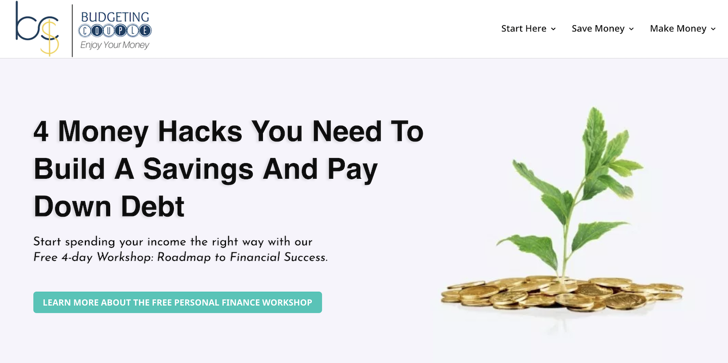
This next image is a great example of an in-your-face lead magnet. It is prominent, again you know what you are getting, and the call to action button is big. When you click on their call to action button, it takes you to their lead page which has even more info, so that you can decide if it’s worth giving up your email.
There is one other thing to note about both of them which is extremely important. They don’t use words like mailing list, newsletter or signup. Their focus is more on giving something away rather than wanting your email address.
Post Gopher
Other than placing lead magnets above the fold on the homepage, you can also use a plugin called Post Gopher. This plugin is AWESOME! It turns your posts and pages into lead magnets and it does it automagically (automatically but like magic).
The plugin turns your posts and pages into pdf’s that can be emailed to visitors. They receive the pdf in their inbox, and their email address is added to your mailing list.
To learn more, watch the video below:
Of course, there are other places on your site to add lead magnets, but combining the two suggested above are the most prominent and less obtrusive.
If you’ve implemented one, two or all of the suggestions above, and you are still not getting conversions, then there could be seven reasons why your lead magnets are not converting and what you can do to fix it.
#1 No A/B Testing
Always have one or two different versions of your lead magnets. This gives you an opportunity to test your copy, image(s), and call to action. Using A/B Testing (also known as split testing) will help you to determine which variation of your lead magnet is converting more than others.
#2 Too Much Text
Don’t get bogged down in the details. Write a concise and compelling sentence that will make them want to download your freebie. Furthermore, people are skimmers. Adding a few bulleted benefits will help as well.
#3 Too Many Form Fields
At a maximum, your form should include only two fields: first name and email. No one wants to be bothered with entering too much information. Also, make sure the first name field is not required, just in case it might be a hindrance for some.
#4 No Benefit
You’ve listed the features of your freebie but not the benefits. It needs to answer the question, “What’s in it for me?”
Let me give you an example. Let’s say that your freebie is a diet plan. One of the features of this diet plan is a caloric tracker to help track daily calories. By adding “so that,” we come up with the benefit. “So that you lose more weight.” So one of the benefits of downloading the diet plan is, “Lose More Weight With The Caloric Tracker.”
#5 Poor Call to Action (CTA)
An effective call to action is extremely important in getting your visitors to make that click. Make sure to use words such as “Download” or “Get”. Better yet, you can use phrases such as “Download Now!” or “Download Your Free Copy Now!” Also, make sure that your CTA button has some color contrast from the
#6 Too Much “Me” and “We”
Make sure that your campaign or lead magnet is less of “me” and “we” and more of “you”. Visitors don’t care about you when reading your lead magnets. At that moment, they care about how will it benefit them. Use more phrases such as “You will learn . . .” or “You will be able to . . .” and so forth.
#7 There Are No Repeats
Make sure to repeat your offer in some form or another on your page. It can be some form of link that redirects to a lead page or it can be a form at the end of the content.
Do you have any other suggestions? Would love to hear from you in the comments below!
Additional Resources
Thrive Leads – You can use Thrive Leads to split test (A/B Testing) your landing pages as well as your lead magnets.
Elementor – You can use Elementor in conjunction with the plugin Split Test For Elementor to create split testing landing pages.
Call to Action
Call to Action is a carefully curated twice-monthly newsletter for digital marketers and creators wanting to increase conversion rates.
